Price drawdown from ATH compared to previous bear markets
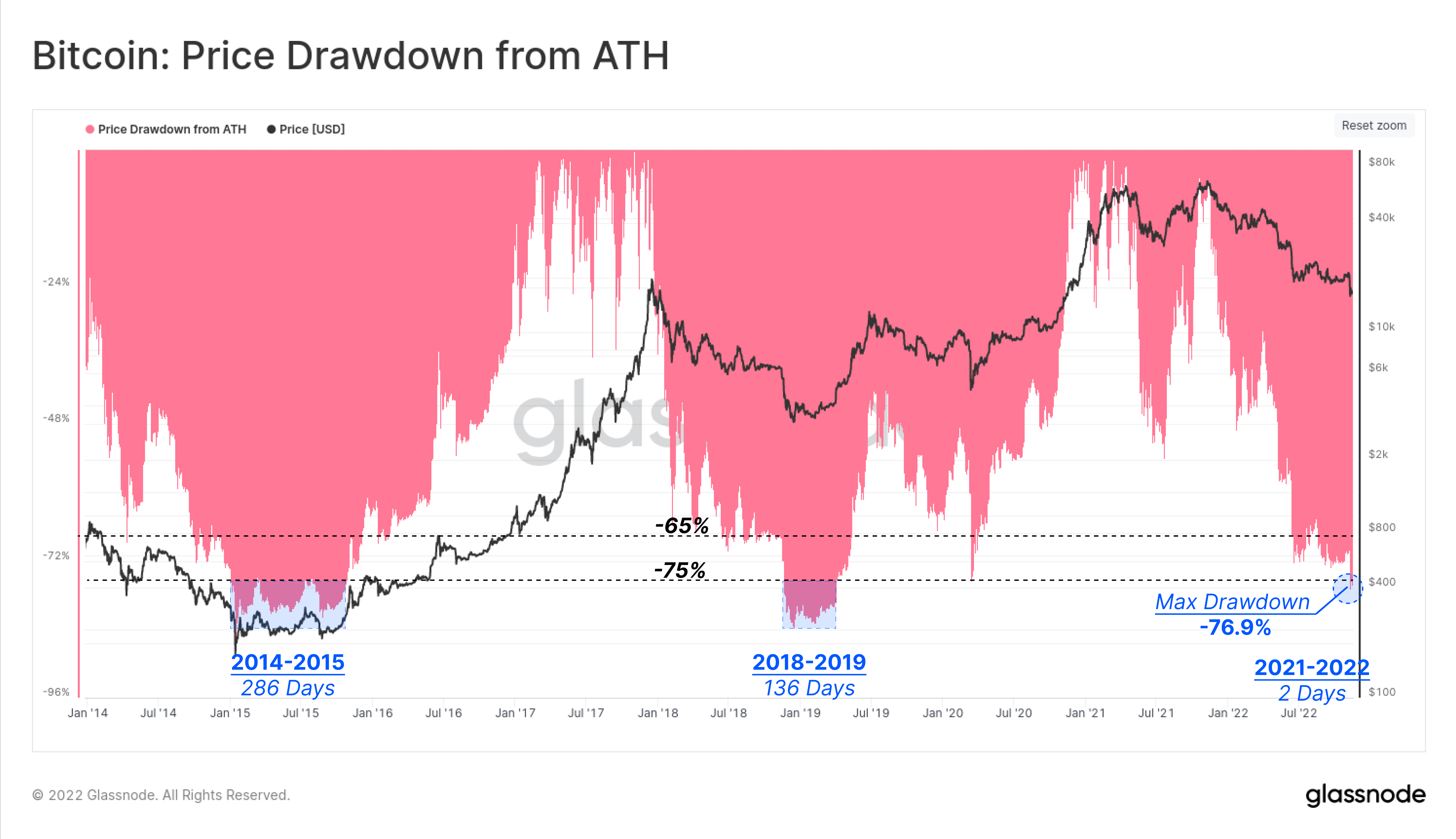
Bitcoin is currently down 75% from its all-time high (ATH), with a max drawdown of 76.9% from the fallout of FTX on Nov. 9th. However, this is not unusual in Bitcoin’s history. During the 2014-15 bear market, Bitcoin retracted over 85% from its ATH, and lasted for around 286 days in max capitulation.
A similar event happened during the 2018-19 bear market, which also saw an 84% drawdown for 136 days. The 76% drawdown started in mid-November, so based on history, this could continue into Q1 2023.
2022, a different bear market compared to 2014 and 2018
The current 2022 bear market is dissimilar from the bear markets of 2014 and 2018 for many different reasons, primarily due to Bitcoin becoming a mainstream currency.
Epoch 2 – Second Halving (2012-2016)
During the 2013 bull run, when Bitcoin spiked to over $1,000 – and in 2017, when the price hit $20,000 – coins were going onto exchanges rapidly.
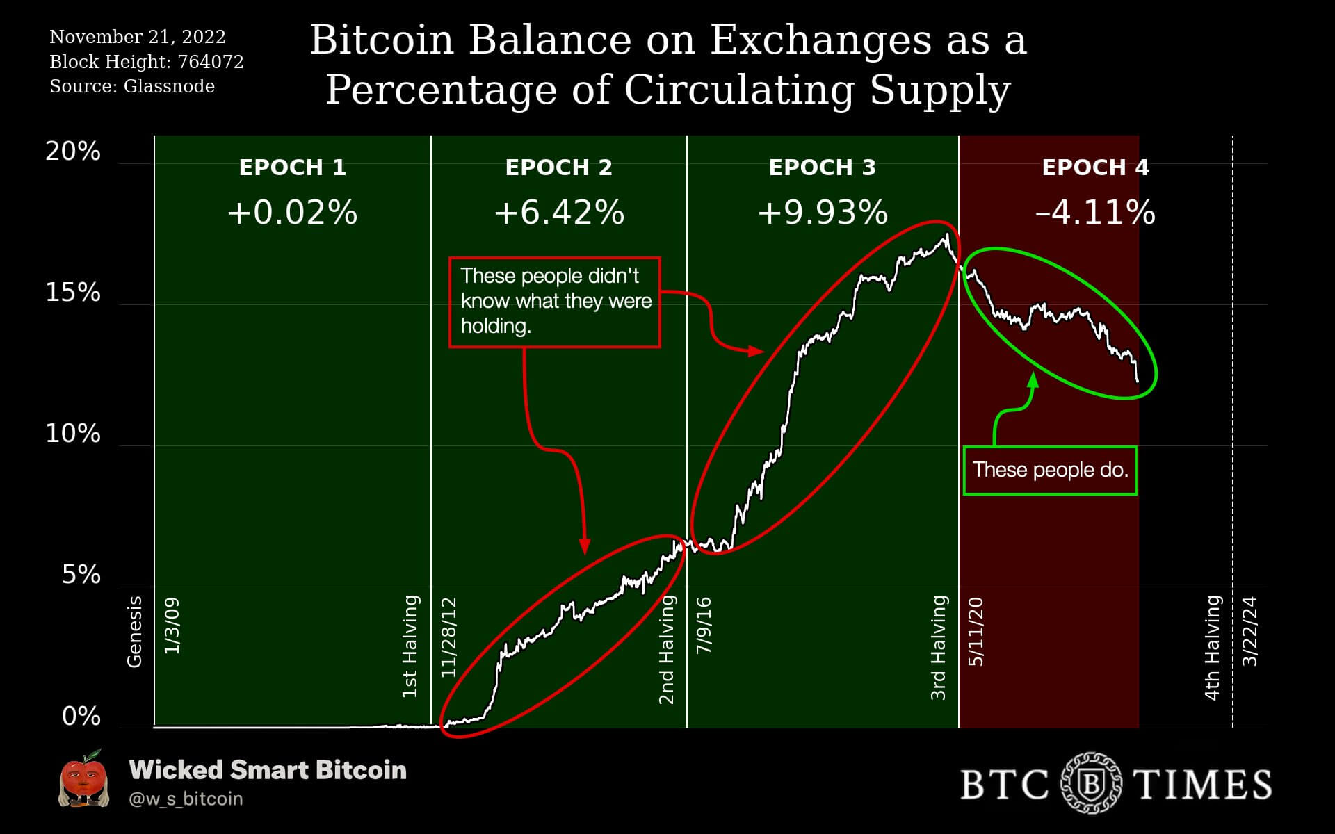
During the second halving, or epoch 2 – which saw Bitcoin claim a high of $1,000 – almost 6.5% of Bitcoins returned to centralized exchanges. From the beginning to the end of Epoch 2, a couple of hundred Bitcoin to over a thousand Bitcoin ended up on exchanges.
Epoch 3 – Third Halving
The 3rd epoch started in the middle of 2016, which saw around 1 million Bitcoin on exchanges. At the end of the third halving, exchanges held over 3 million Bitcoin, just before Covid 2020. This saw the price of Bitcoin rally to $20,000 at the end of 2017 but saw a low of $3,000.
Epoch 4 – Fourth Halving
Since covid and the start of the fourth halving, exchanges have seen a decline of over 4% of Bitcoin supply, leaving around 12% of supply left on exchanges. In the past 30 days, over 135k Bitcoin has been withdrawn from exchanges — a 1% deduction of Bitcoin supply. This is the first epoch that coins are being removed in a bear market. So far, Bitcoin has seen a low of $15,500 from its peak of $69,000.
This time is different, retail are withdrawing their coins
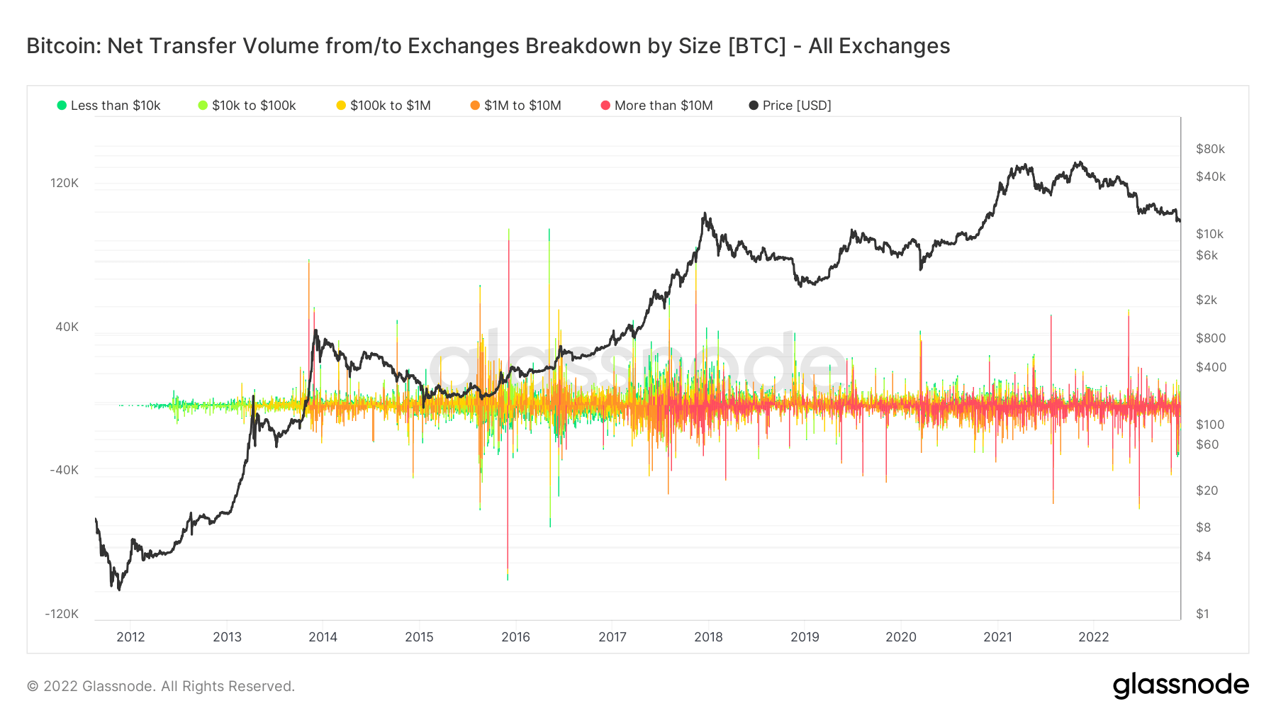
A further deep dive into what cohorts are withdrawing their Bitcoin from exchanges:
As can be seen since Bitcoin’s inception, a flurry of green to yellow transactions has signaled small transactions. As time went on and up to around 2017, a storm of red transactions started to occur, signaling institutional adoption coming into the space.
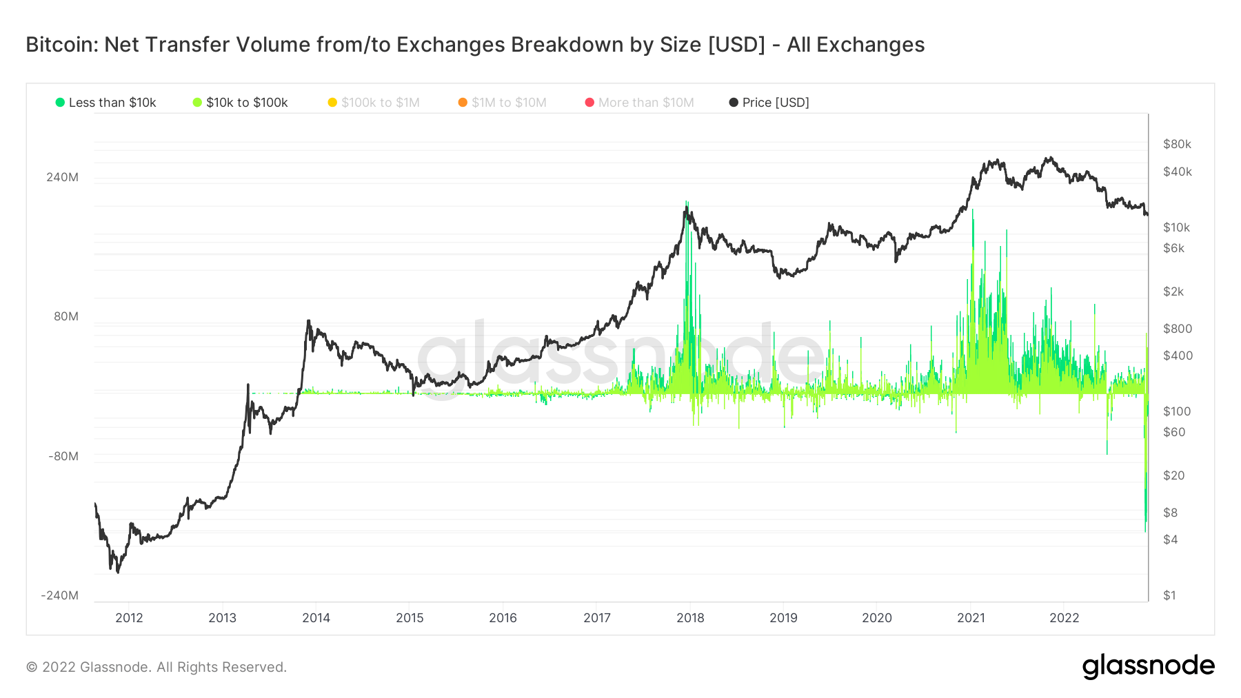
However, filtering to show retail transactions below $100K, it is apparent that they FOMO’ed during the peak bull runs of 2017, and 2021 — with over $200 million during peak days. On the other hand, over the past 30 days, the network has seen the most withdrawals from retail ever, surpassing $180 million. Retail may have learned a massive lesson with the fallout of FTX and the meaning “not your keys, not your coins.”
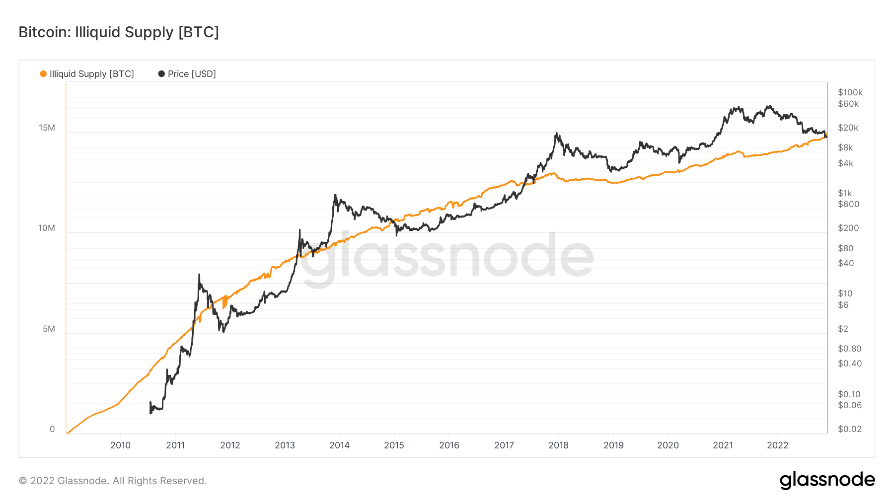
Due to the collapse of FTX and other centralized entities within the crypto space, self-custody has been a hot topic, and the number of coins in self-custody has grown exponentially in 2022 (from 14 million to 15 million). The current circulating supply of 19.2 million would put self-custody coins at 78%.
Mempool was packed, people aren’t waiting for proof of reserves
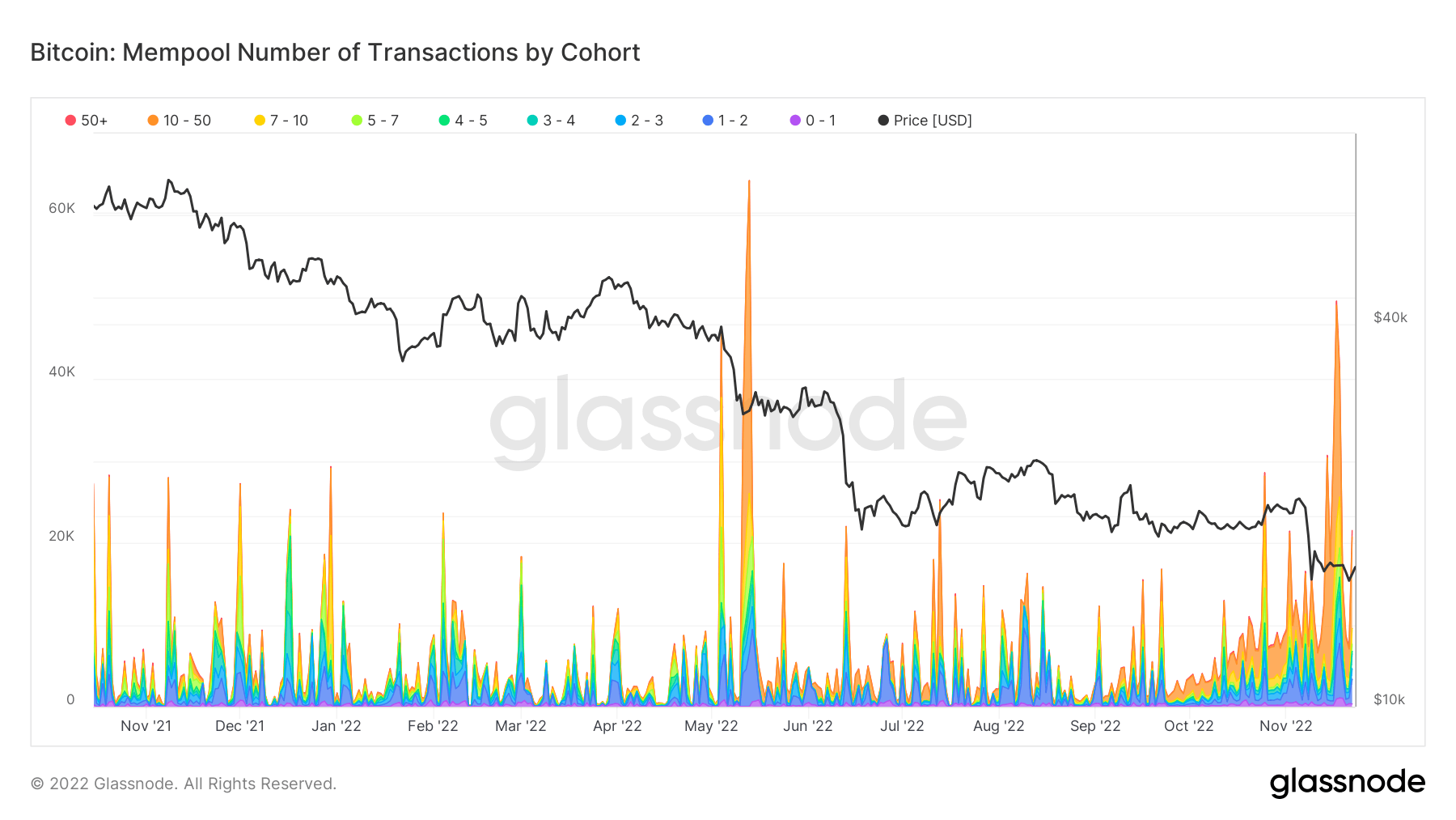
Due to the number of coins leaving exchanges, the mempool has seen a substantial increase in transactions — most notably in June and November. A clear correlation can be seen in capitulation from the fallout of FTX and Luna.
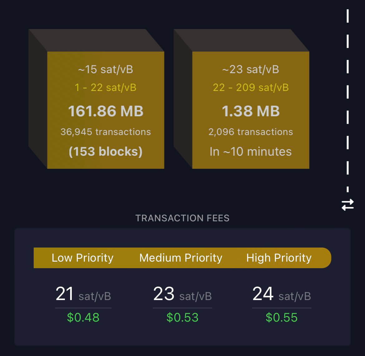
What happened last week saw a massive amount of network volume and traffic building up on-chain. When the mempool gets backlogged, nodes prioritize those with higher fees during high volumes.
On Nov. 14th, 154 blocks were waiting in the mempool. This was the most considerable backlog since May 2021 and such massive activity has rarely been seen outside of a bull market.
New entities coming into the ecosystem
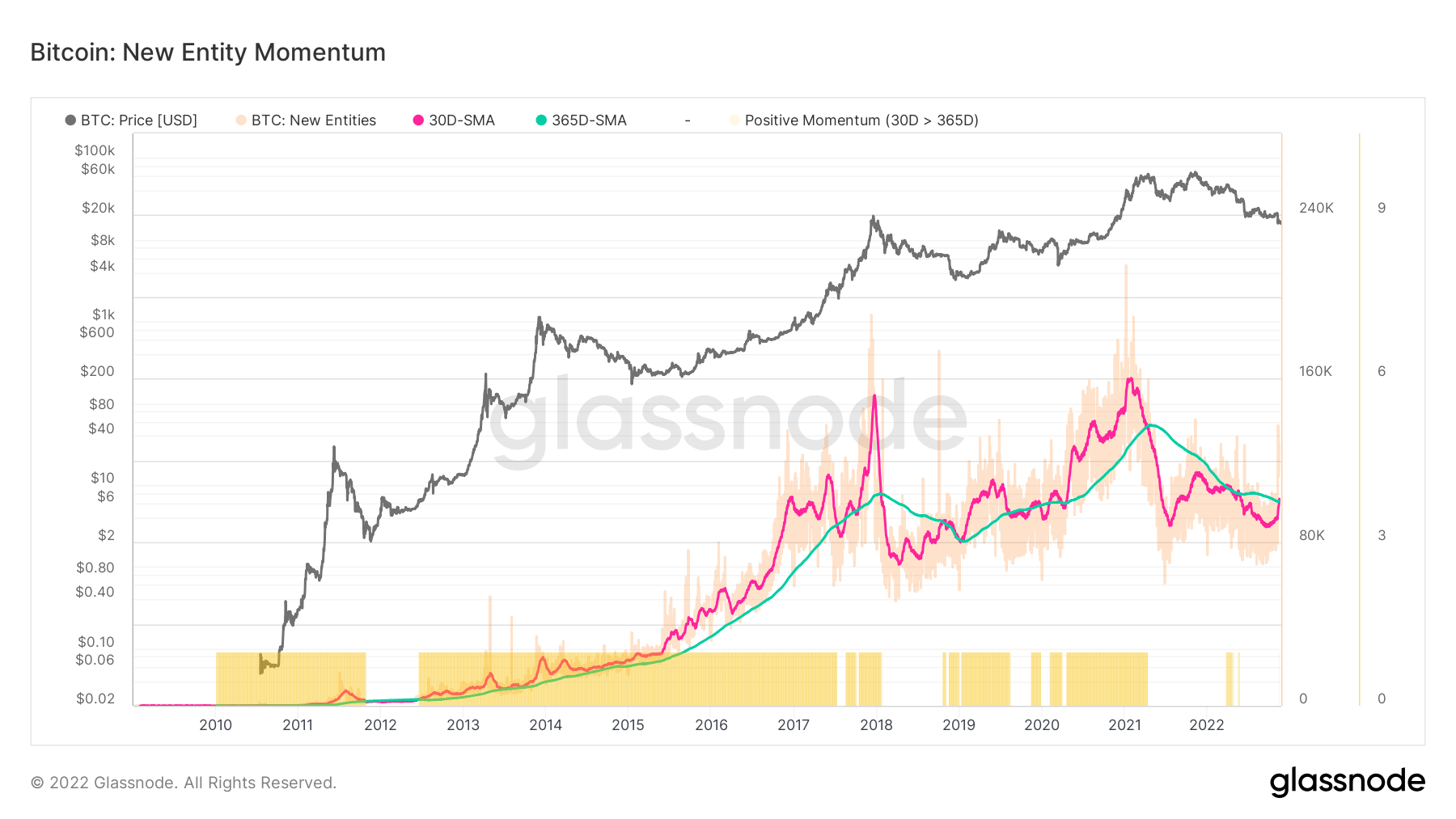
Healthy network adoption is often characterized by an uptick in daily active users, more transaction throughput, and increased demand for block space (and vice-versa). The number of New Entities on-chain utilizes our entity-adjustment methods to more accurately gauge the magnitude, trend, and momentum of activity across the network.
Digging deeper into on-chain data shows that most non-zero addresses were created in the past month. The 30-day simple moving average (SMA) of new addresses surpassed the 365-day SMA, flatlining for the better part of 2022.
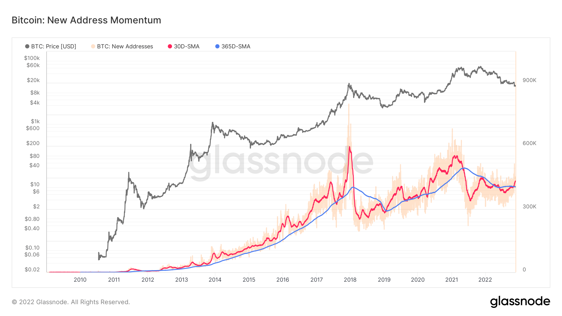
The growth in the number of new addresses transferred into a higher entity momentum. All new non-zero balance addresses had to acquire that balance in the past month, drastically increasing new entities onto the network.
The last time both new entity and new addresses were above their 365DMA was during the 2020-2021 bull run.
A historic inverted U.S. yield curve
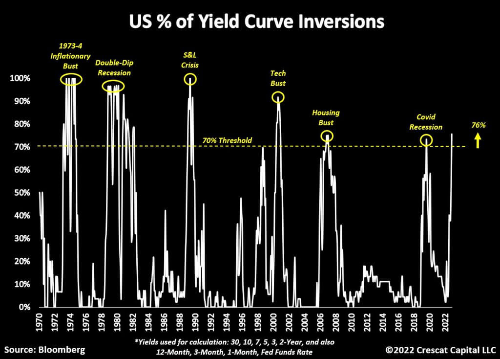
An inverted yield curve is when short rates are higher than long rates, and the market tells the fed that they are too tight.
What causes the curve to invert? Short rates increase due to the market believing the fed will keep increasing rates, while long rates fall below short rates on the belief that the economy will, at some point, see inflation fall.
Many different inverted yield curves are looked at to identify recessions, most notably the ten-year minus two year and ten-year minus three months.
Currently, over 75% of the entire U.S. treasury curve is inverted; anytime above 70%, a recession has occurred in the past 50 years.
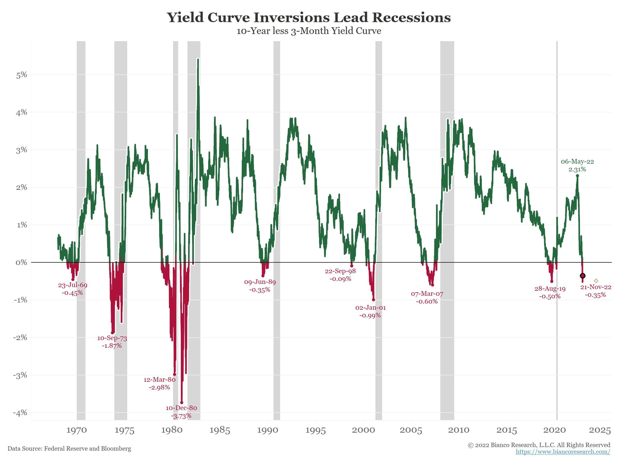
Economists believe the ten-year less 3-month yield spread is the most accurate for identifying recessions as most research has gone into it. The curve has been inverted for almost two weeks which signals “persistent inversion.”
When the 3mo/10yr yield curve inverts for ten consecutive days, it is 8 for 8 in predicting recessions over the last 50+ years. The average lead time is 311 days or about ten months. – Jim Bianco (Bianco research)
Credit: Source link


 Bitcoin
  Ethereum
  Tether
  Solana
  XRP
XRP  Dogecoin
  USDC
USDC  Lido Staked Ether
  Cardano
  TRON
TRON  Avalanche
  Shiba Inu
  Wrapped Bitcoin
  Wrapped stETH
  Toncoin
  Sui
Sui  WETH
WETH  Bitcoin Cash
  Chainlink
  Pepe
Pepe  Polkadot
  Stellar
  LEO Token
  NEAR Protocol
  Litecoin
  Aptos
Aptos  Wrapped eETH
  Uniswap
  USDS
USDS  Cronos
  Hedera
  Internet Computer
  Ethereum Classic
  Bonk
Bonk  Bittensor
  Render
  Ethena USDe
  POL (ex-MATIC)
  WhiteBIT Coin
  Dai
Dai  MANTRA
  Artificial Superintelligence Alliance
  dogwifhat
  Arbitrum
  Monero
  Stacks
  OKB
OKB  Filecoin
